ARTICLE
Asked to Brush a Company Name — The One Thing I Settle First
2026-07-22
Where Will the Name Live
When someone asks me to brush their company name or logo, the first thing I ask is not the meaning of the characters or their stroke count. It is: "Where will this sit, and at what size?" Carved into a signboard, tucked small in the corner of a business card, floating on the white of a website — the same three characters need a different line weight and a different balance of space depending on where they land. Calligraphy is often thought of as something finished on the paper, but a logo only comes alive once it is used. So before I write a stroke, I place in my mind the spot where the name will finally stand.
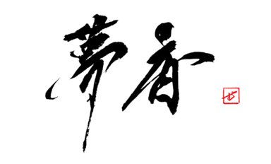
I brush the name once on a sheet of hanshi first — ink freshly ground, my usual brush, nothing prepared. That sheet is not for delivery. It is to feel how the name rolls in my hand: the balance of the faces, the direction of a flick, the white that opens between the second character and the third. Only after writing it do I know in my hand whether this is a name for a signboard or one that survives being shrunk small.
Chosen from Dozens, Not One Stroke
Unlike a live performance, a logo is not a single decisive stroke. If anything it is the opposite — I write the same name thirty, fifty times. I spread the sheets across the studio floor, step back, and start eliminating. The ones that are skilled but "not this company's face" go first. I pin the survivors to the wall and look again the next morning; a line that looked good at night can read too hard in daylight. A name is seen every day, so I choose the one that does not tire after a night's sleep.
I got this wrong once. For one commission I confidently delivered a bold, sweeping sheet full of dry-brush kasure — the piece that drew the eye most when laid on the floor. But shrunk to business-card size, the fine spray of that kasure collapsed into a smudged black lump. A line that is beautiful large does not always survive small. Since then I shrink every logo candidate down to the smallest size it will actually be used at, and confirm the line holds before choosing. Even kasure, calligraphy's great showpiece, turns self-indulgent if I don't measure where it will be used. On the beauty of these dry-brush breaks, I have written in The Aesthetics of Kasure.
Running the Meaning Through the Line
Having settled where it lives and chosen a line that holds, the last thing I run through it is the meaning of the name. Before writing, I always ask what the company or shop actually does. A handcraft workshop and a business built on speed call for a different velocity in the very same stroke — a line set down slowly and stopped carries a different air than one run fast and released. On the make-up of the characters used in names I have written in Popular Kanji for Names; but in a logo I do not explain the meaning, I run it through the line itself, at a speed the eye receives before the mind reads.
That is why brushing a company name is not, to me, ghost-writing. It is taking a name into a line three thousand years in the making and standing it up in the world once more. On how a single line can carry a name, I have written in The Power of a Single Line. If you are thinking of a name in brushwork, decide only "where it will live" and come talk to me through the commission page. The rest we find together, as I brush it dozens of times.