ARTICLE
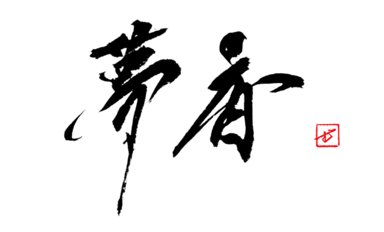
無 (Mu) — Not 'Nothing,' but the Figure of a Dancer
2026-09-02
無 Was Never a Picture of Emptiness
If you write 無 as if it simply meant "nothing," you miss its core. The original 無 is a pictograph of a person dancing, holding ornaments — animal tails or plumes — in both hands. The four dots beneath, 灬, are not fire. I read them as the dancer's feet, or the remnant of the hanging ornaments. It shares a root with 舞, to dance; the meaning "none" was borrowed later for its sound. So 無 is not a character that draws emptiness. It was born from a figure full of movement, and "none" was laid over it afterward. Since learning this, I stopped drawing the lines thin and fading. A dancer is standing there — so the character is allowed to stand. The character that means "there is none" keeps the most human presence of all. On 無 as a Zen word — the "none" that comes before the split of has and has-not — see why a single character takes the longest to write.
Building the Twelve Strokes (The Verticals and the Four Dots)
無 has twelve strokes. It looks complex, but the frame is simple: one short horizontal on top, four verticals standing at even intervals below it, two long horizontals skewering them like a stick, and finally four dots struck beneath. What decides the character most is the spacing of those four verticals. Uneven, and the whole thing tilts like a crooked shelf. After the top horizontal, I set the two outer verticals first, then divide the space between them by eye into thirds for the rest. I am watching the four white gaps come out equal before I watch the lines themselves. Of the two long horizontals, draw the lower one a little longer — a longer base lets the character be caught and steadied below. Then the four dots, 灬. They are not decoration but the platform the whole character rests on: the outermost two lean slightly outward, the inner two drop straight down. When the four align on one level, the grid above stands quietly on top. The full stroke order lives on the kanji dictionary page for 無.
Writing It as a Full White, Not an Empty One
The most common failure here is letting the top grow heavy until the four dots below get crushed. I once spent a day writing 無 large — one character on a half-sheet of 35 by 68 cm. Building the grid boldly was fine, but momentum carried me, and I struck the four final dots as large as the grid above. The character became top-heavy, the dots looked driven into the ground, and I discarded nearly twenty sheets. What I understood was that the four dots are the legs that carry the top. They are a dancer's feet — they must touch the ground and bear the weight above lightly. Rewriting, I made the dots a size smaller than the lines above, but set them wide apart. Not packed tight — leave white between the four dots too. Then they became a platform, the grid stopped floating, and the whole character held the pose of "movement brought to a standstill without emptying out." 無 is not an empty character precisely because this white is not blank but full. On reading white as a material, see white as a material — the paper's white is not left blank.
無 does not draw the fact of nothing. It was born from the figure of a dancer, and "none" came to dwell in it. So I don't write it fading away. Divide the white between the verticals into four, catch it on a slightly longer lower horizontal, and set the four dots small and wide as a platform. That alone, and your 無 will not fall into emptiness, but stand as a full white that still holds its movement.