ARTICLE
Four Kanji for Green: Writing 緑, 翠, 碧, and 蒼 Apart
2026-10-22
There are four kanji for green in Japanese — 緑 (midori/ryoku), 翠 (sui), 碧 (heki), and 蒼 (sō). In conversation they overlap comfortably, but writing them in sequence with ink and brush, what arrives first isn't the colour difference — it's the physical one. Each character has a different weight, a different balance, a different resistance at the tip of the brush.
緑 and 翠 — Plants and Feathers
緑 is a keisei character (形声文字): the thread radical 糸偏 on the left, and 彔 as the phonetic element on the right. 糸偏 is six strokes — a column of thin vertical marks. When I write it, I keep the radical narrow. If I let it spread, 彔 has no room, and the balance collapses. Keeping six strokes compact and sending the width across to the right side is the whole problem. It's a habit that took many sheets to develop, but once it settles into the hand, it transfers to every character built on the same radical.
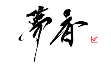
翠 combines 羽 (feather, four strokes fanning horizontally) with 隹 (bird, a vertical structure). It refers specifically to the colour of the kingfisher — not an abstract green, but the vivid, living green of a particular creature's wing. Writing it means negotiating two competing directions: the horizontal spread of 羽 against the vertical emphasis of 隹. If I give 羽 too much space, 隹 gets cramped. If I favour 隹, 羽 shrinks. After many attempts, I found that making the final horizontal stroke of 羽 slightly shorter than it wants to be opens just enough space for 隹 to sit correctly.
碧 and 蒼 — Stone and Grass
碧 layers 王 (jade), 白 (white), and 石 (stone) — all mineral, all hard. It describes the blue-green of jade or turquoise. When I write it, the base element 石 needs a long crossbar to anchor the structure above it. If I cut that horizontal stroke short, the whole character floats upward. I've come to think of 碧 as a character that belongs to horizontal compositions — the weight of stone settles sideways more naturally than upright. Written tall, 碧 seems uneasy with itself.
蒼 is formed from the grass radical 艹 and 倉. It's the most muted of the four: grey-green, the colour of 蒼天 (sōten, a sky between green and blue) or 蒼白 (sōhaku, ashen). Writing it, the two strokes of 艹 need to stay level, and the first horizontal of 倉 should extend further than instinct suggests. I made this mistake many times — shortening that stroke, watching the character contract. When the crossbar is long enough, 蒼 carries an open, receding quality. The impression of distance is written into the width of a single stroke.
The four kanji hold four different greens: 緑, the warmth of dyed thread; 翠, the life of a bird's wing; 碧, the coolness of stone; 蒼, the reach of grass and open sky. When choosing which ink colour to work with, the question is close to the same one: which green does this word need? In commissioned work, I start there — with the character, then the meaning, then the line. — Commission inquiries are welcome here.