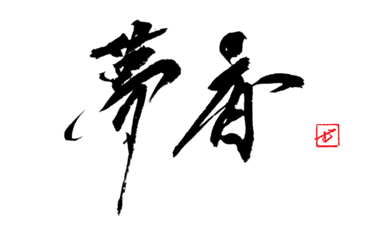
KANJI DICTIONARY
On'yomi
こ
Kun'yomi
かえりみる
Strokes
21
JLPT
N1
Meaning
Look Back, Review, Examine Oneself, Turn Around
顧 reads ko (on'yomi) or kaerimiru (kun'yomi), meaning "to look back, to care for, to visit." It is formed from 雇 (phonetic, giving the reading ko) and 頁 (head, the semantic). 21 strokes, JLPT N1.
Readings of 顧
- On'yomi: こ (ko) — 回顧, 顧客, 顧問, 三顧の礼
- Kun'yomi: かえりみる (kaerimiru) — 来し方を顧みる, 危険を顧みず
Meanings of 顧
Three distinct but related senses branch from the root image of turning the head to see what lies behind:
- Turn and look back: reviewing the past. 回顧 (kaiko, retrospection), "顧みる" in the sense of reflecting on one's path.
- Care for / mind: attending to others or to risk. 顧慮 (koryo, consideration), 顧問 (komon, adviser), 顧客 (kokyaku, client — literally "one who looks toward the shop").
- Visit: as in 三顧の礼 (sankō no rei) — the story of Liu Bei visiting Zhuge Liang three times to bring him into service.
顧 vs 省: Both read kaerimiru but differ in direction. 顧 faces outward — looking back at the past, or regarding others. 省 faces inward — examining one's own conduct. "家庭を顧みない" (neglecting one's family) uses 顧; "わが身を省みる" (reflecting on one's own actions) uses 省. When the gaze turns outward, write 顧; when it turns inward, write 省.
Origin of 顧
顧 is a phonetic compound. 雇 (ko) provides the reading; 頁 (ōgai) depicts the human head, rooting the meaning in the act of turning the head to look behind. From this original sense of spinning around to see what is there, the meaning widened to "attending to" and "visiting."
- Radical: 頁 (head)
- Stroke count: 21 (雇 12 strokes + 頁 9 strokes)
- Phonetic component: 雇 (ko)
Writing 顧 in Calligraphy
顧 has a left-right structure: 雇 (12 strokes, left) and 頁 (9 strokes, right), in roughly equal width.
With 21 strokes, the key challenge is keeping the horizontal spacing open. Both halves are tall; if the horizontals in either side crowd together, the character becomes dense and unreadable. The left sweep of 雇 extends outward, so hold the right side 頁 slightly taller and narrower — this keeps the center of gravity settled between the two halves.
Inside 雇: place the upper 戸 small, then stack 隹's four horizontal bars at even intervals. Inside 頁: keep the top horizontal short, draw the central 目 tall and narrow, and open the final two dots left and right to anchor the whole character to the ground.
Gyosho (Semi-Cursive)
Link the horizontal strokes of 隹 in a flowing run to lighten the density. Keep 頁 legible — its structure anchors the character's readability.
Sosho (Cursive)
頁 is a radical that simplifies dramatically in cursive. The space opened by abbreviating 頁 lets the energy of 雇's left sweep breathe outward. The tension between left movement and right compression defines the line.
Tips for Writing “顧” Beautifully
- • In Kaisho (楷書), write each stroke carefully with clear stops and flicks
- • In Gyosho (行書), let the brush flow rhythmically between strokes
- • In Sosho (草書), simplify boldly while maintaining balance
- • 21 strokes total — following the correct stroke order naturally creates beautiful form
COMMISSION
This Character, Brushed as a Work
MUKYO creates commissioned calligraphy — logotypes, title lettering, and original artworks for brands and spaces, as well as live calligraphy performances. Available in Japan and worldwide.