ARTICLE
仙 (Sen) — When a Person Enters the Mountains, They Become an Immortal
2026-09-05
仙 Is a Person Who Entered the Mountains
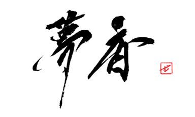
仙 has five strokes. On the left, the person radical 亻; on the right, 山, mountain — those two parts, and nothing else. A person enters the mountains. Someone who leaves the ordinary world, dwells in the peaks, does not age, and walks as lightly as if treading on clouds — that is 仙, the immortal, the mountain sage. An older form, 僊, carried the sense of rising high; it later settled into the simple 人 + 山 of 仙. I read this origin as a matter of the character's center of gravity. A person on flat ground does not become 仙. Because they have moved to a high place — the mountain — the character floats slightly off the ground. So when I write 仙, I do not plant it heavily on the paper. I let the line carry the lightness of a person standing atop a mountain, the soles of their feet just barely lifted from the earth. Every word built on this character — sennin, senkyō, senkaku — points to a place half a step aside from our own world. The character itself holds that half step.
Building the Five Strokes (The Person and the Mountain's Height)
The order: the two strokes of the person radical first, then the three of the mountain. With only five strokes, the quality of any one stroke becomes the quality of the whole character. The first thing I decide is how far to extend the vertical of the person radical. In 仙, that vertical rises taller than the mountain, pulled cleanly upward. The person stands higher than the summit — I give that impression through the height of the vertical alone. For the mountain's three strokes, I take the central vertical as the axis and set the left and right a little lower. Spreading the mountain wide would steady the character, but then it is no longer 仙. This is not a mountain rooted in the earth but a mountain a person is crossing, so I keep it a little narrow, drawn tall. The gap and the height difference between the person's vertical and the mountain's central vertical — that is the whole character. The full stroke order lives on the kanji dictionary page for 仙.
Lightness Comes from White Space, Not Thin Lines
I once spent a day writing 仙 large — one character on a half-sheet, 35 by 68 cm. Wanting it to look light, I drew the lines thin and faint. The character did not become light; it just grew scrawny and frail. After discarding more than ten sheets, I understood that lightness is decided not by the thickness of the line but by the white space beneath the character. Rewriting, I returned the lines to full weight and instead placed the character slightly above the paper's center. With wide white below, the person stands atop the mountain and the sky opens out beneath their feet. Don't weaken the line — leave the bottom empty and let the character float. This is the same judgment as calming the 争 on the right side when I write 静, stillness: a character's meaning rises from placement more than from the line itself. I wrote about that in why 争, strife, stands in the right half of the character for "quiet". The gesture of 仙 — leaving the world and growing light — is close to the frame of mind of setting something down before you write.
仙 is a person who entered the mountains. So I do not seat this character on the ground; I lift it slightly, onto the mountain. Pull the person taller than the mountain, draw the mountain narrow and tall, and leave sky below the character. Rather than feigning lightness with thin, feeble lines, float it with white space. That alone, and your 仙 will stand in that light place, half a step aside from this world.